AW20: Key Colours.
My Top 5 Key Colours for AW20.
I have identified approximately 15 key colours of the season but here is a round up of my top five. These aren’t particularly geared towards a specific market (i.e fast-fashion, premium, luxury) they are just the ones that I feel most excited about!
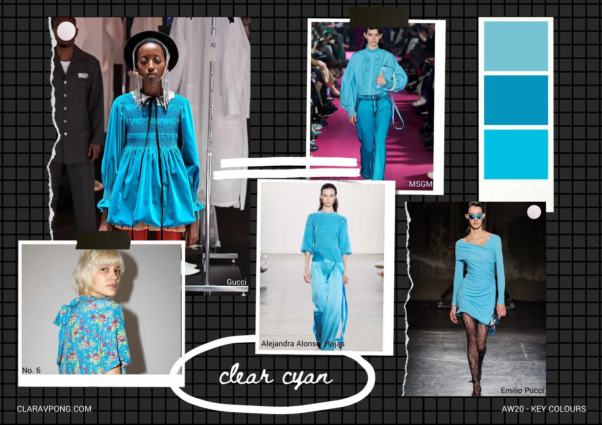
‘Clear Cyan’ is super fun and can be applied to pretty much anything! Fantastic as a base print colour, smocked and shirred like at Gucci, or stretched and ruched at Emilio Pucci.
‘Limestone Pastels’ is based off the fact that although these are basically pastels, they all had a chalky tone to them. They look best when mixed with other shades when outfit building or several shades used within a collection. The strongest example is definitely by Yeezy which demonstrates that this idea works best with matte fabrications which amplifies the ‘chalk-like’ tone.

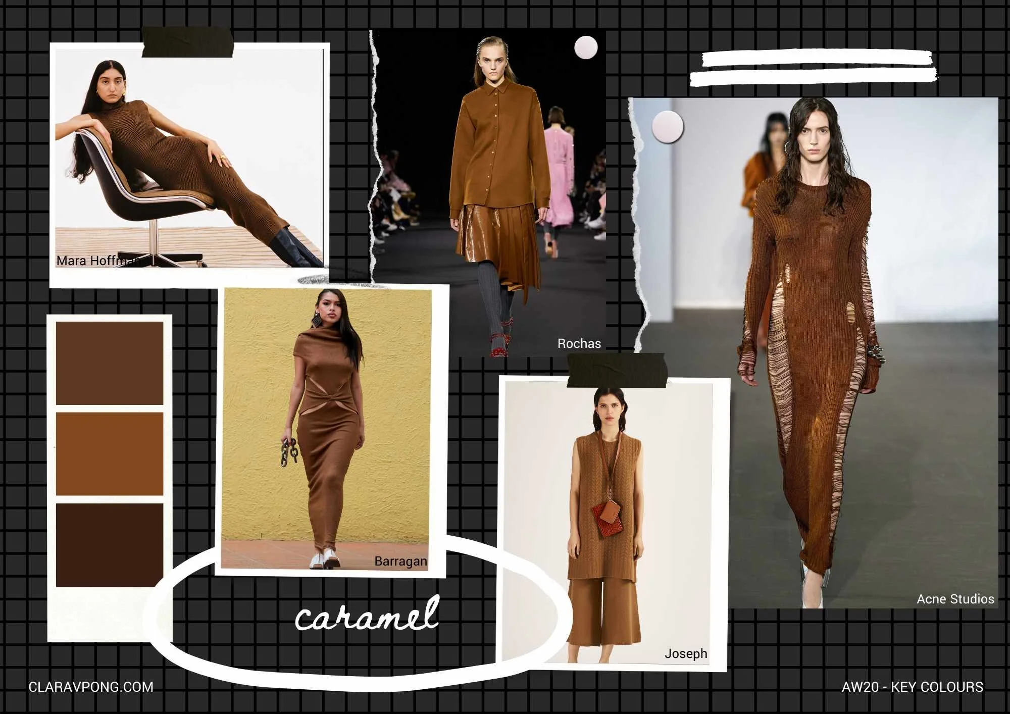
‘Caramel’ and ‘Crisp Olive’ (or similar versions of it) are often used for the Autumn/Winter season but for newness, is best used in fabrics with interesting textures and/or details. The fringing used at Bottega Veneta is so refreshing, a detail that I usually see in off-whites and creams or black, never in this amazing shade of olive!

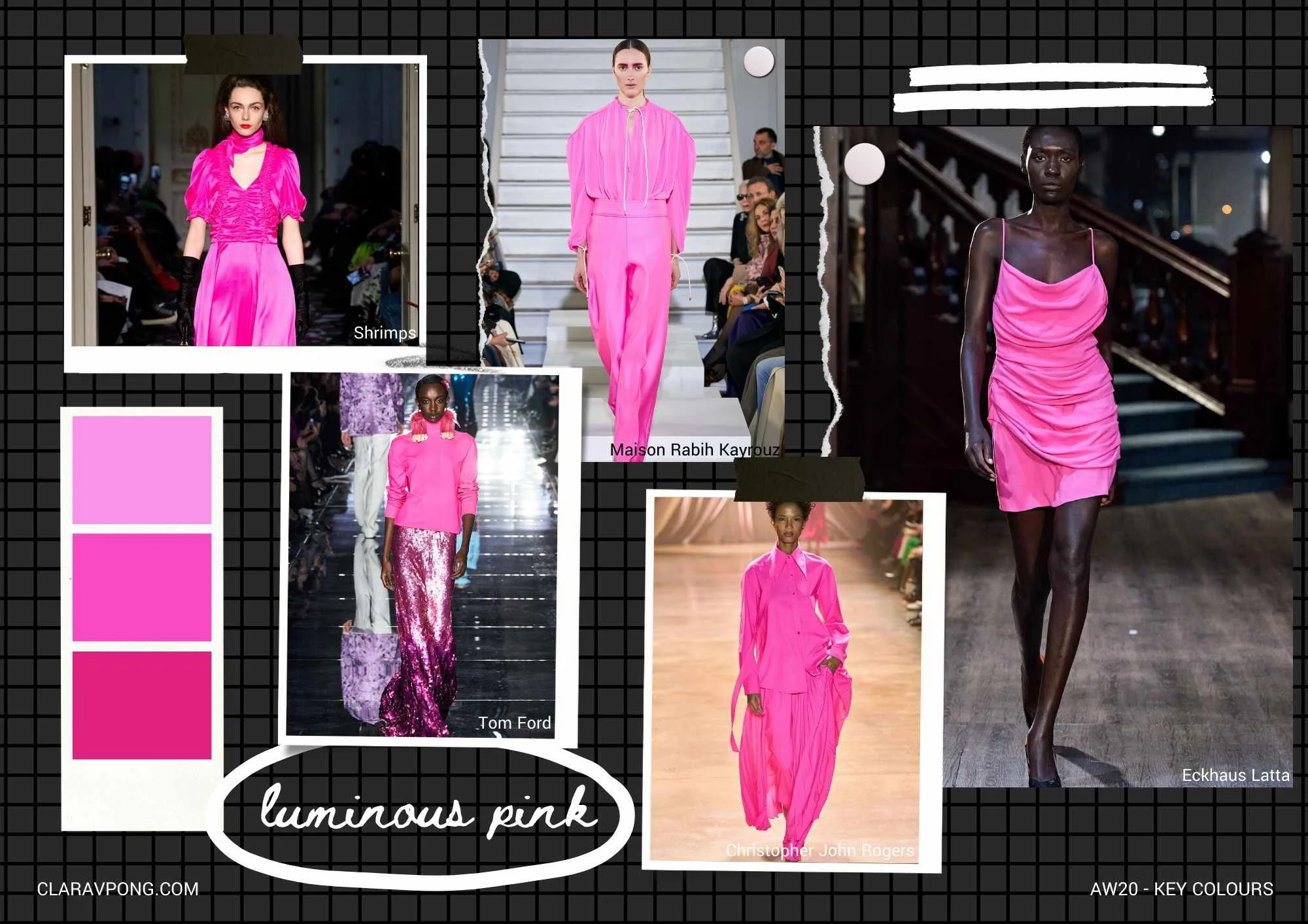
Neons have been around for a really really long time and they don’t seem to be budging at all!! They have also made their way through all types of product. This ‘Luminous Pink’ definitely feels strongest out of them all so don’t hold back, use it in the shiniest fabrics and take the next step and create sparkle by using embellishment!
Images from Vogue.com │ Moodboards by CLARAVPONG.com