How to create a Fashion Collection.
I thought it would be really interesting to take you through my own design process (and some tips along the way!) for one of my favourite collections. From the researching stage, to the final campaign shoot to help give an insight on the sort of tasks and thoughts a designer would go through. Although it has been a few years now, the process hasn’t really changed much for me. Sure, I may find quicker ways to do things now with the abundance of apps and programs available at my fingertips and of course experience, but the steps still remain very similar to what I was doing 4 years ago, 8 years ago, 12 years ago.
‘Sartorial Pearl’ was a collection I created for a brand called ELVI in 2017 for the Spring/Summer 18 season. I started it around June 2017 to launch Jan/Feb 2018 which is extremely tight due to the product mix where items are needed to be created in the Far East and there are lots of things to consider which I will do a post about one day. (If creating your collection locally, the process would be different and you can do it in less time).
ELVI was originally a plus size brand, catering for a slightly mature market. They wanted to revamp it so it appealed to a younger audience and to also be more inclusive by offering smaller sizes.
I didn’t want the sizing aspect to influence me too much, not just because they were expanding their size range but I believe everyone of all body shapes and sizes should have access to clothing they want to buy, whether you’re a SIZE 6 or a 32. So, I ignored a lot of the ‘this is what plus-size women want’ comments which I also felt were becoming more and more of a cliché because every time I spoke to someone who shopped plus-size, it was always the opposite!
How I began.
The first step of starting a collection is dictated by the timing, circumstances, budget, aesthetic, the customer, end use, so many more factors…so it is paramount to have all this information up front.
In this case, I actually started this collection while on my way to China to visit the largest textile market in the world, on my 2nd day of working for the company! It was my first time alone, as prior to that I had always gone with a large team but it was really good and a huge learning curve in regards to decision making and having nobody to bounce ideas off with.
In a nutshell, the purpose of visiting this market is to source fabrics, trims, components and anything else needed to create a collection. You don’t need to manufacture in the same place you source things from but it is super handy if you do as it cuts out a lot of time and faff. I also want to add that this trip was pretty much to source for the entire Spring/Summer 18 season, so I wasn’t just working on one collection, I was working on multiple at the same time, or at least thinking and planning them, even though they would come later on in the year. Travelling to the Far East is an expensive but vital task when manufacturing overseas, so time needs to be spent well.

Sourcing.
During the visit, I collated hundreds of fabric cards (literally, two suitcases full) to reference for my designs, these swatches also helped me pull together the colour palette. Prior to the trip however, I had already done my forecasting for the season which covers key shapes, colours, prints, themes etc. so I did have some focus which is extremely important when you have deadlines as the textiles market is basically like having 7 vertical football pitches filled with fabrics and trims… and that is only the main part of it.
Forecasting can be done several ways. It is entirely dependant on you as a designer or who is doing it for you and what they are experienced in. Some people just solely like to look at catwalk as it suits their market, or like myself, prefer to look at as many things as possible which includes Film, culture, social-economics, exhibitions etc.
Future fashion trends can be influenced by many other factors that are not even Fashion related...and this is something a lot of new designers don’t realise.
Sure, look at catwalk shows, other fashion brands, what are influencers wearing etc… but bear in mind this is literally touching the surface of the type of research you should be doing. You can’t forget that everything else that happens in the world will influence the trends just as much, or even more...and most importantly, what is your intuition?

Research.
Whilst researching, I saved thousands of relevant images. Vintage, film screen stills, fashion editorials, something ripped from a magazine. It always comes together in the end and I’ve definitely made hundreds of moodboards in the last 14 years. I had also analysed the catwalk shows as thoroughly as possible, to pull out some key ideas.
There was a definite interest in lilac and olive/khaki greens and I liked the idea of having them together in a collection, a whimsical pastel, which seemed to be the new ‘millennial pink’ and a moody colour to contrast. These formed the crux of the colour palette.
When it comes to colour research, it is also really important to look beyond Fashion. What is the automotive industry doing, what’s Pantone saying? What about interior design? What happened in the last 2, 5, 8 years in the seasons? Any patterns or consistent colours occurring?

Key Inspiration.
Here are the key images that formed the foundation of my moodboard. The catwalk image of the trench coat was more of a marker that I definitely needed a trench coat in the collection.
Key details that I felt strongly for were soft, bubble sleeves which were dominant on the catwalks but it also prompted me to explore vintage photos which is basically where most things derive from. At the same time, I came across rouleau loops and covered buttons which I adored as an additional detail and reflected in some details I found while comp shopping. Another image I came across is the shell and pearl which cemented my ‘key trim’ idea. As you can see, just from very few images, I have already created a very whimsical, feminine but timeless feel which is also my own ‘handwriting’ when it comes to fashion design.

Key Muses.
I wanted to break down a little more on the key components of building a moodboard which includes any key muses. I wouldn’t normally have a separate board for them as they should just be on the main board, but having them isolated can help you figure out what all the other imagery should look like if you’re struggling.
In this instance, I had Hayett B McCarthy and Jennae Quisenberry in mind, but the main source of inspiration actually came from a photoshoot by Peter Lindbergh in 1986 of models wearing trench coats on a beach.

So, coupled with all the above information, this is what my final board looked like! I had it all in loose tears during my trip to China and put it altogether when I was back in the UK as it was important for me to relay the trend back to my team so that everyone was on board and all relevant departments were aware of what the theme was so they could start preparing collateral and content i.e. marketing, photoshoots, social media, getting in touch with suitable influencers etc.
Just to stress, I didn’t simply start laying out all my research and it was done. I laid everything out, took some away, reshuffled the layout, put some things back in, took more things out, reshuffle again… until it ‘made sense’ to me. This can sometimes take a couple of hours, a couple of days or weeks as not only am I looking for the correct imagery but it also needs to be in the right colour too.
The collection I was building was going to cover 20-40 different items of clothing, across 2-3 months so it was really important that I had enough inspiration on there to cover these ‘options’.
Knowing the timing of the collection is also really important as I have already mentioned at the start of this blog post. As the first drop is required for January, I had to be aware of the weather and ‘end-use’. It’s going to be cold and nobody is going to be looking to buy slip dresses so I had to also plan this out very thoroughly, with the last and smallest drop trickling in at the beginning of March, which is when another, new trend would also launch.
Number of trends, options and launching times vary a lot across brands. Very established (20+yrs) brands will strictly go by their own history of sales e.g. if nothing apart from black items sell in January, a dominant part of the collection should have black options. Smaller brands are more flexible and happy to adapt to ensure there are more exciting items to buy since they will most likely offer less items to buy and have less stock overall.
Naming a moodboard is just as important as the images on it. It’s exactly the same as how you may title a film or a book. As my board was generally ‘smart’ looking, I wanted to fuse two contrasting elements which is how I came up with ‘Sartorial’ (relating to the soft, tailored side of it) and ‘Pearl’ which highlights the main trim/hardware I was using.

The Colour Palette.
Once I have completed the moodboard, the colour palette is quite easy to put together but it doesn’t always work that way. Sometimes you may find yourself building the palette before anything else as maybe a group of colours was actually your key inspiration.
As you can see, I have added my green and lilac shades as mentioned earlier on, also a hint of print (polka dot), some denim, lace for texture and a new colour (rosewood and cinnamon) derived from some imagery on the moodboard. I wasn’t sure if these would go but I wanted to try nevertheless.
Planning.
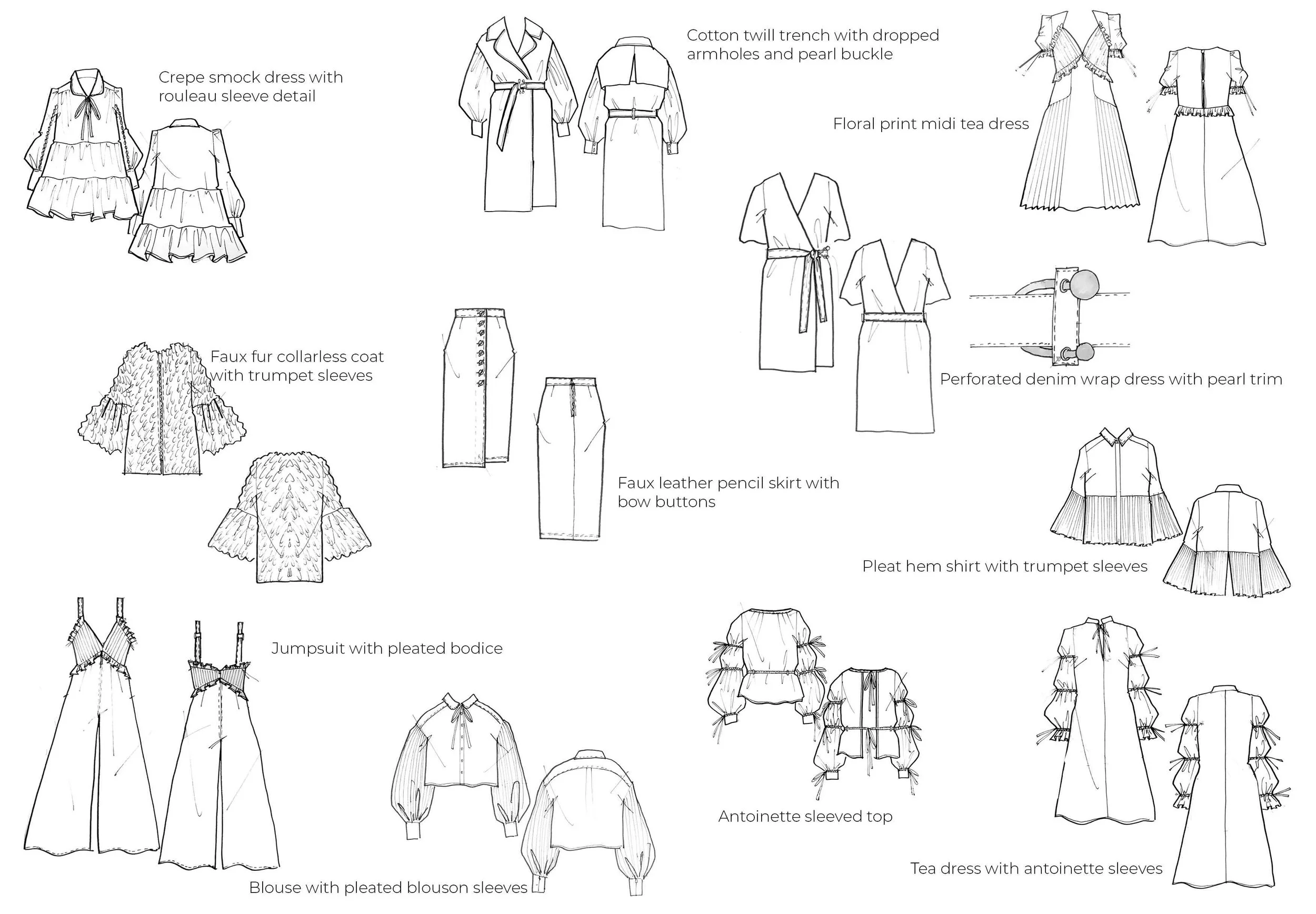
From my board images, I started to extract some key shapes and ideas I definitely wanted to do. These came in the form of really rough doodles and adding tiny bits from my colour palette next to them to have a better sense of the colour balance. The image here is actually just the neater version and part of my range planning to help demonstrate that each piece was ‘strong’ on its own and wasn’t going to fight for attention with another style.
However, looking at it in black and white, does bring up the question if two tea dresses are required. However, one is in a floral print and to launch in February, while the other is in a solid colour and launching a month later.
Going back to my initial inspiration of the photograph by Peter Lindbergh, I prioritised sketching up the hero trench coat that I had in mind. I immediately knew I wanted to change it up a little with dropped armholes, fullness from the biceps and in one of my key colours, olive green. I’ve shown a compilation of what my tech pack looked like and basically, the more information you can provide to your manufacturer, especially one where English is not their first language, the better. I’ve also shown what the final garment looked like (the campaign shoot!), and this was the very first sample which came back and it was 99% perfect. This is always desirable as each time you request a new sample to be made after fitting it, just keeps costing more. I requested it to be made in a heavy cotton twill so that the silhouette would retain it’s shape and the sleeves wouldn’t collapse.
Sometimes I just know exactly how I want something, and sometimes other things need a bit more thought. However it wasn’t until I was in the market that I found these gorgeous pearl trimmed slide buckles which became an essential detail for the entire collection and the final touch for my hero trench, which I later called ‘The Abalone’, which is a ‘marine snail’, since I was on a pearl-inspired collection and love to keep in theme!
I decided to use two of the slide buckles together as I wanted a more ‘premium’ look and to further emphasise the pearl details. I knew I wanted to use them as a ‘belt’, so I experimented with different ways of doing this with my trusty measuring tape(s), took a photo, printed it out and sketched over it to demonstrate to manufacturers how the belt would attach.


I think I designed around 50 ideas for this collection. So that’s x50 tech packs with full measurements, colour, fabric references, trims, button sizes, zips, inside finishes, linings, facings, lengths… everything!!! The options for this collection were 20-40, this was based on company budget and brand mission. So 50 seemed like a good number to take into account that some styles may not come back as you hope for, but it is really essential to try new ideas otherwise how would you ever have anything new and exciting. Some places I have worked at will sample much more due to higher budgets and anything not used for a collection may just be ‘tweaked’ and used elsewhere so it is not wasted… but there is also a lot of waste too especially in fast-fashion manufacturing.
I was also simultaneously doing the same thing (creating tech packs) for 2-3 other moodboards/stories while also thinking about what I was going to do for peak Summer, so you can imagine how intense it can be and how important it is to be really prepared and focused with all your research and the information you needed upfront from the company or whatever your business mission may be. Don’t waste time designing 50 things, if you only have a budget for 5 things. It will just waste time and money for all parties and not a good start to building important relationships with manufacturers. If you want 5 pieces, then focus and put all your energy into designing 8-10 incredible pieces, rather than 50 ‘OK’ pieces.
So, here was the final campaign! Due to schedules, the shoot had to happen a lot earlier than planned, and only a small amount of pieces had come back from suppliers but luckily they were of some of the key pieces such as ‘The Abalone’, ‘The Poe’ (lilac smock dress), and ‘The Oyster’ (white eyelet denim wrap dress) which was actually planned for a March launch so it was great to get that in earlier for the shoot.
I did also sample pieces in the cinnamon, rosewood and dark blue denim as seen on my colour palette, but we, as a team, felt that they worked better in another story that I had created, so we simply moved them across. This is something that will happen all the time and will most likely happen during a process called ‘range building’.
It was really important to me to also have different textures (such as the green patent skirt, the legging which had a brushed surface, the faux fur khaki coat and the lilac shearling jacket) within the collection for added depth, so do consider this if you are creating a collection with a small colour palette to avoid it from looking flat.
Having these pieces styled and professionally shot was also the cherry on top! It was my first experience working on set, directly with the Photographer, Creative Director, Stylist, Make-Up Artist and Model which was so much fun and there was so much joy in seeing the collection that I had worked so hard on, really come to life! It also taught me the significance of working with other talented people and the difference it makes. As a collective, they had taken my initial ideas of the collection and positioned it way above my expectations.


Photographer: Daniel O’Connell│Creative Direction: Tabrez Pathan │ MUA: Irena Rogers
Model: Martine Lervik│ Designer: Clara Varakachanapong-Jones │ Stylist: Lorna McGee