SS20: Key Colours.
My Top 5 Key Colours for SS20.
Now that the SS20 shows have come to an end, I begin to assess key themes through all the collections, and colour is always one of my favourite things to look at.
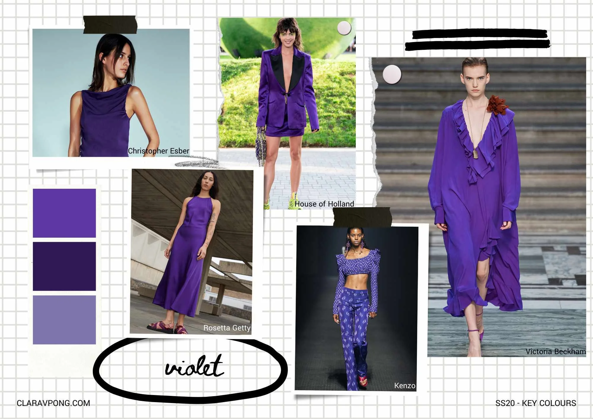
I firstly wanted to highlight this beautiful shade of ‘violet’ which is commonly seen in Autumn/Winter collections instead of Spring/Summer. I especially loved it in all its diaphanous glory at Victoria Beckham and can see this being worn at Summer weddings or on holidays, rather than the usual night-time-party-dress.
It also works really well as a base colour for prints both small and large scale and delicious in shiny finishes!!

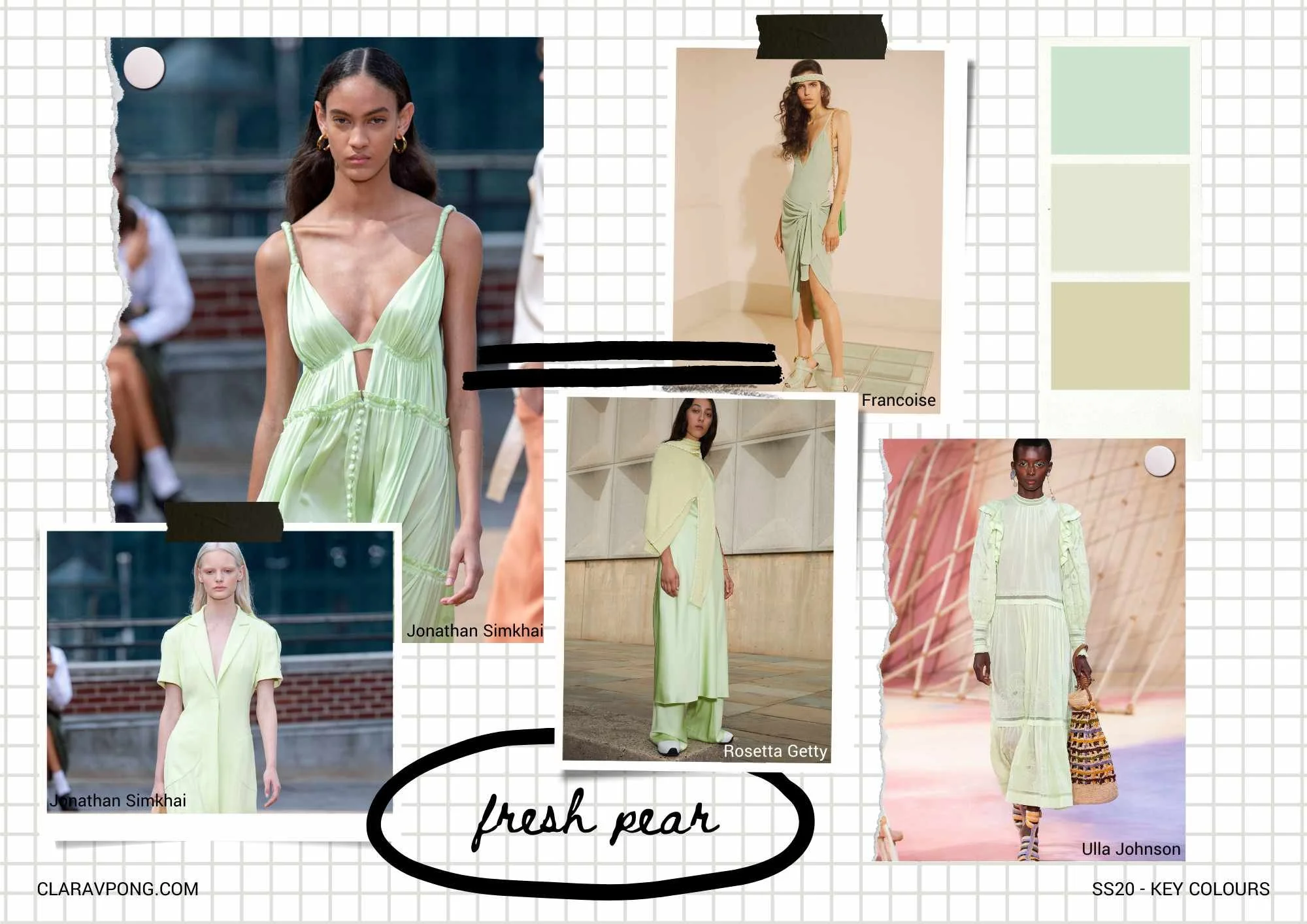
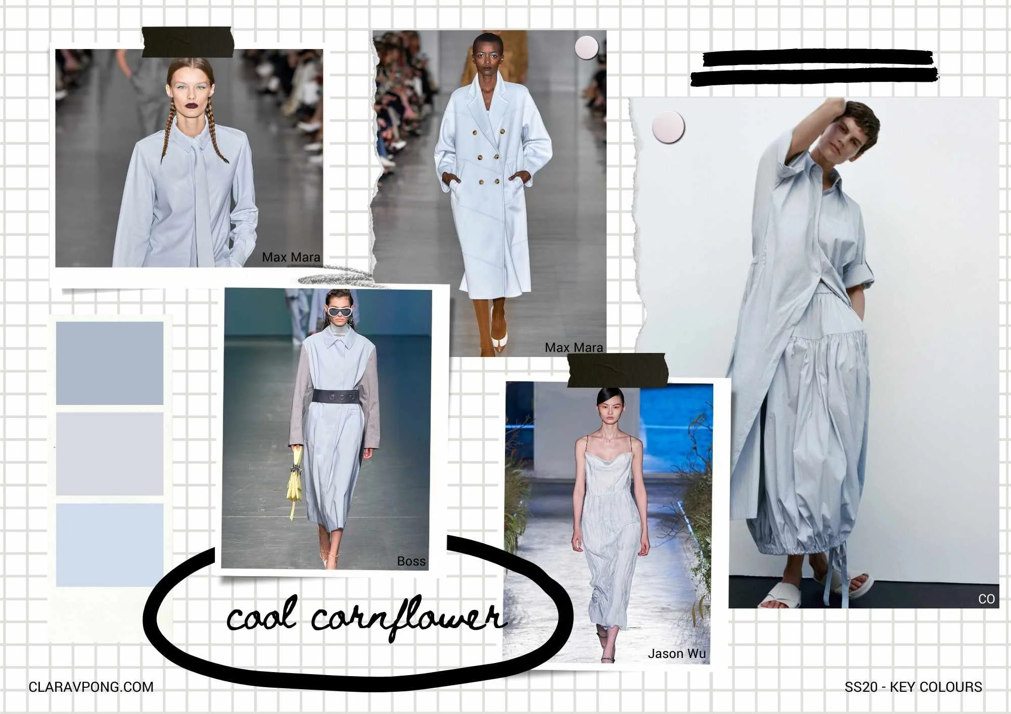
‘Hibiscus Pink’ is a refreshing shade of pink as we move away from the neons of the previous season and looks contemporary on clean, tailored styles. ‘Fresh Pear’ and ‘Cool Cornflower’ work beautifully side-by-side and within the same collection. Like ‘Hibiscus Pink’, they look new on ‘clean’ pieces but also really gorgeous on silks and other fabrics with fluidity which gives it a premium edge. These shades are often hard to find on stock fabrics (nice ones anyway!) so it may be worth introducing via prints or getting them made-to-order.
‘Apricot Dusk’ and shades within its family has always a favourite of mine. A flattering shade across skin tones and something about it always looks premium. I love it on the denim at Chloé, finished with the ecru stitching! If you also love this colour, do have a look at the rest of the Chloé collection to see just how well it works! I’ve also added a close up of the jeans for full appreciation!


Images from Vogue.com │ Moodboards by CLARAVPONG.com